Creative Engineering / Systems
This Portfolio
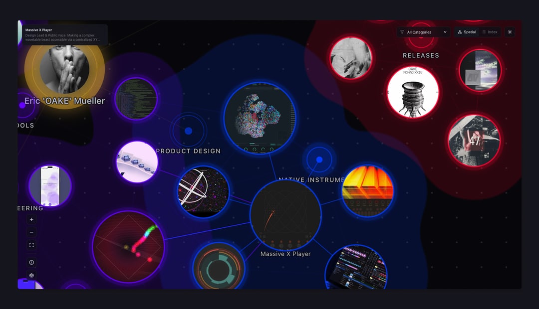
The Gravity Well – A Spatial Operating System
A portfolio that behaves like a living organism. Featuring a D3.js gravity well, organic metaball clustering, and a content-aware layout engine.
The Problem with Portfolios
I always wanted to create a sharable space that documents my work as an artist, designer, and someone who explores random ideas via code. "Creating a Portfolio" became a running joke with close friends and colleagues. Should it be functional? Should it show off design skills? Should it be both?
The answer depends on what you want it to achieve. Do you need it to land work? To reference your own projects? To build something you've always wanted to try? Those questions shape the portfolio into something useful.
For me, it had to show off a little. It needed character and needed to speak through its presentation. The medium is the message. But it also had to be readable. And if there's a chance to have both, you should take it.
The Inspiration
A lot of us know the amazing websites on Awwwards. I wanted my portfolio to be that. But honestly, I didn't have the skills to code something like those sites, and they didn't fit my needs anyway. They're beautiful, but they don't make connections between projects visible or discoverable.
Scrolling through content in a linear fashion, using tags and hyperlinks to connect projects, is limited. You're stuck in the middle of only two points in a vastly greater body of work. I like to work non-linearly. I enjoy tools like Miro or Figma, where I can sort data into a canvas that can be read in every direction. I take notes with Obsidian and really enjoy its "Graph View."
One day, while working on the first prototypes of the Preset Explorer, I watched a YouTube series titled Liber Indigo: The Affordance of Magic by Justin C. Kirkwood, who also wrote a book about it. This is where it clicked.
I suddenly understood why I was drawn to systems of non-linearity. To open space, graphs, and nodes. It enabled a UX design breakthrough with the Preset Explorer by thinking of it as an interconnected planetary system affected by physics like gravitational pull.
The video series (which I can only encourage everyone to watch) laid out how our operating systems and visual-as-well-as-interaction-language in computers are all based on the boring, analogous, really old world of offices. We still work on "Desktops", use "Folders" and "Files" – but how would a computer system look if it wasn't invented by an office supply company like Xerox, but was (re)invented right now?
I once told my friend and collaborator Attila Kenyeres, an amazing photographer and hairstylist, to just create a password-protected Miro board and use that as his portfolio. His clients loved it.
As more time went by and projects like the Preset Explorer matured, the idea of using the same principles: Miro, Graph View, markdown files, growing systems... in my portfolio started to make more and more sense.
The Solution
I knew I didn't want to use any of the standard website builders or CMS systems out there. I also knew that if creating new entries for the portfolio was too complicated and involved more than one or two steps, I wouldn't keep it updated. It would be a one-shot, fire-and-forget approach. It needed to feel as if it grew organically and effortlessly.
So I had three important points to cover:
-
Dual Navigation
I wanted to create a node-based system that shows interconnections between multiple projects at once and goes beyond a simple list. But I also wanted that simple list, since it's what users are used to. -
Markdown-Driven Content
I write my notes in Markdown in Obsidian. Writing about a new project should feel like writing a simple note. -
LEFO (Layout Evolves From Objects)
I didn't want to layout every project page by itself. I wanted the content of my notes to inform the project page of how it needed to look.
So I adapted what I learned from developing the Preset Explorer to my personal needs within a portfolio. Since I love playing with Lego and really enjoy when atomic design systems fall into place in Figma, I came up with a quite simple system: LEFO (Layout Evolves From Objects).
Each project is a simple markdown note formatted in a certain way. The system identifies the formatting and creates a layout specific to the content of the markdown file. All pages have a unified look, with slight variations, depending on their content. If I want, I can force a layout and overwrite the rules.
The Tech
The Spatial View is built with D3.js. Projects orbit their categories like a solar system. The physics simulation creates organic clustering—projects that share techniques or themes naturally drift together.
The Metaballs aren't just decoration. Using SVG Gaussian blur and threshold filters, category boundaries become fluid membranes that shift and breathe as you drag nodes. (Desktop only)
The Portholes are live thumbnails. Each node is a window into the project, masked inside the physics objects using SVG patterns.
LEFO analyzes content at build time:
- Has video? → Render the Cinema layout (full-width media).
- Heavy text? → Render the Magazine layout (sticky sidebar metadata).
- Just a link? → Render the Article layout (centered focus).
The Result
The portfolio is a living system. Adding a new project is as simple as dropping a markdown file into a folder. The spatial graph updates automatically. The index view sorts it. The layout engine handles the rest.
Everything else was fine-tuning.